Timeline
A timeline allows you to view how data has changed over time: for example, how demand for real estate purchases changed in different seasons. With the timeline, you can:
- Filter layer data by a date attribute without changing a data sample. To do this, you can select the time period on the timeline to display layer data on the dashboard scene.
- Play an animation of data changes for the selected period.
- View a graph with the distribution of the number of objects depending on the time period.
The timeline can only work with data that contains an attribute with the
Datetype. Make sure that when uploading data as a file, you specify the data in supported date and time formats and selectDatein the Type column.
You can use the timeline for layers with any data visualization methods, except for the Buildings method.
Example of working with the timeline:
Configuring a widget
-
Go to the Dashboards tab.
-
Open the required dashboard.
-
Open a scene using the arrows
 and
and  . If there is only one scene in the dashboard, it opens automatically when you open the dashboard.
 -
Click
 icon in the lower-left corner.
 -
Specify the timeline parameters.
-
Manage the data viewing with the player using any of the following ways:
- Use the
 and
and  buttons (not available for the Contour visualization method).
 - Use the arrows and .
- Move the slider manually.
- Use the
Parameters
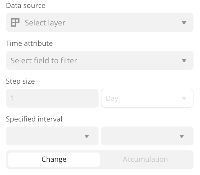
-
Data source: data layer.
-
Time attribute: data attribute with the
Datetype: date only, date and time, or date and time with a timezone (see the supported date and time formats). -
Step size: step size used to shift the time interval limits when playing the animation. You can specify any value in seconds, minutes, hours, days, months, or years. The graph on the timeline displays the distribution of the number of objects depending on the specified step size.
-
Specified interval: limits of the time interval that are used to display data.
-
Playback mode: how the specified time interval moves along the timeline when the animation is played:
-
Change: both limits of the time interval are shifted by the step size.
Example:
-
Accumulation: the left limit of the interval remains unchanged, and the right limit shifts by the step size. The data accumulates over time.
Example:
-
-
Animation speed (configured in the lower-left corner of the timeline): how fast the data on the dashboard scene is updated when the animation is played. For example,
1.0is once per second,2.0is twice per second, etc.
What's next?
- Get to know more about other Widgets types.
- Quick start.
- Get to know how to work with Data and Data visualization.
- Get to know more about Layers, Dashboards, and Scenes.
- Get to know prepared Analytics presets.