Contour
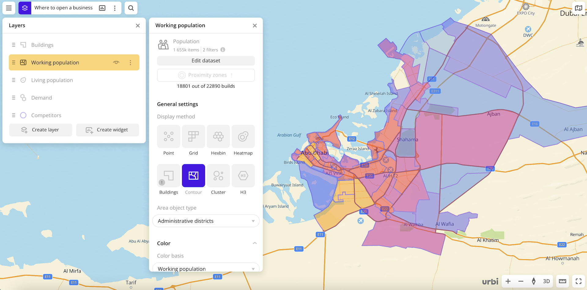
The Contour visualization method is useful when you need to understand the distribution of data on a certain area object. Physical and legal boundaries of buildings are taken into account.
Overview
To choose a visualization method:
- Go to the Dashboards tab.
- Open the required dashboard.
- Open a scene using the arrows
 and
and  . If there is only one scene in the dashboard, it opens automatically when you open the dashboard.
 - To open the layer, click
 icon and select the required layer.
 - In General settings, select the Contour visualization method.
- Set the remaining visualization parameters if necessary.
The data is visualized on the map.
Parameters
For the Contour visualization method, the following parameters are available:
-
Area object type: type of areal object on which the contour is built (
Administrative districts,Settlements,Neighborhoods,Administrative divisions,District,Region). -
Caption: turning on the caption on contour elements.
-
Color: selecting the color of the data display.
-
Color basis: attribute based on which the elements on the map and in the legend are colored according to the color scale. The available values depend on the data in the sample. You can select only numeric attributes.
-
Color scale: set of prepared color samples.
-
Invert: select to invert the selected color scale.
-
Steps: number of steps in the color scale from
1to10. -
Legend: configuring of data ranges in the legend. Ranges are calculated automatically depending on a type of scale (for
Logarithmic,Linear, andExponentialtypes). You can also customize ranges manually by entering the required range limits or changing the order and number of ranges (Adjustabletype). The specified upper (right) limit is not included in the range. The maximum number of ranges is 10.
To change the order of ranges, hold down icon next to the required range and drag it. To add a range, click
  icon. To delete a range, click
  icon.
icon. -
Color aggregation type: function used to aggregate the attribute values located in one visualization element (a contour):
Sum- the sum of the values.Mean- the mean value.Min- the minimum value.Max- the maximum value.
The aggregation type is displayed in the tooltip when hovering the cursor over a contour on the map.
-
Type of scale: distribution type used to calculate data ranges in the legend:
Logarithmic- logarithmic distribution. Suitable for displaying data that changes over a wide range or differs by several orders of magnitude.Linear- uniform distribution. Suitable for displaying values of the same order.Exponential- exponential distribution. Suitable if you need to highlight small values and ignore large ones, and also for displaying data that changes quickly.Adjustable- manual configuring of ranges. In all ranges except the last one, the specified upper (right) limit is not included in the range.
-
Opacity: setting an opacity of the elements on the map.
-
-
Outline: enable to display an outline around the elements.
- Outline color: selecting an outline color on the color palette or in HEX format.
- Stroke width: stroke width in pixels from
1to25. When Height is turned on, the setting is not available.
-
Height: enable to display the data as columns on the map. To enable three-dimensional display format, select the 3D in the bottom-right corner of the map.
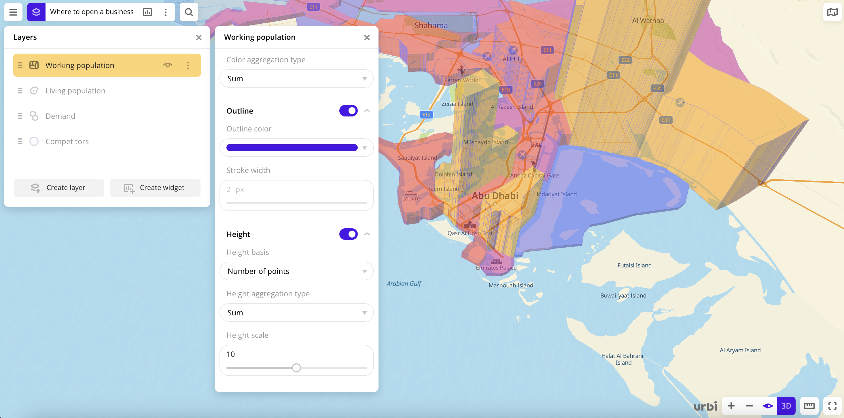
-
Height basis: attribute based on which the columns on the map are formed. The available values depend on the data in the sample. You can select only numeric attributes.
-
Height aggregation type: function used to aggregate the attribute values located in one column:
Sum- the sum of the values.Mean- the mean value.Min- the minimum value.Max- the maximum value.
The aggregation type is displayed in the tooltip when hovering the cursor over a column on the map.
-
Height scale: column height multiplier from
0.1to20.
-
What's next?
- Quick start.
- Get to know how to work with Data.
- Get to know more about Layers, Dashboards, Scenes, and Widgets.
- Get to know more about other Data visualization methods.
- Get to know prepared Analytics presets.