Visualization
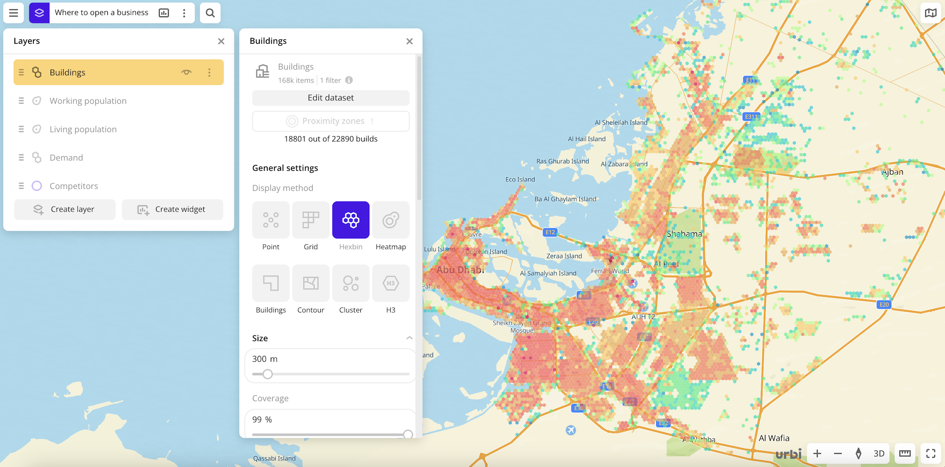
Urbi Pro service provides several data visualization methods:
The visualization is customized for a specific layer, even if the layers are created from the same data sample. You can change the visualization of a layer at any time. Additional settings are available for each visualization method.
Getting started
- Go to the Dashboards tab.
- Open the required dashboard.
- Open a scene using the arrows
 and
and  . If there is only one scene in the dashboard, it opens automatically when you open the dashboard.
 - To open the layer, click
 icon and select the required layer.
 - In General settings, select a visualization method.
- Set the remaining visualization parameters if necessary. See a list of parameters in the description of each visualization method, e.g., Point.
The data is visualized on the map.
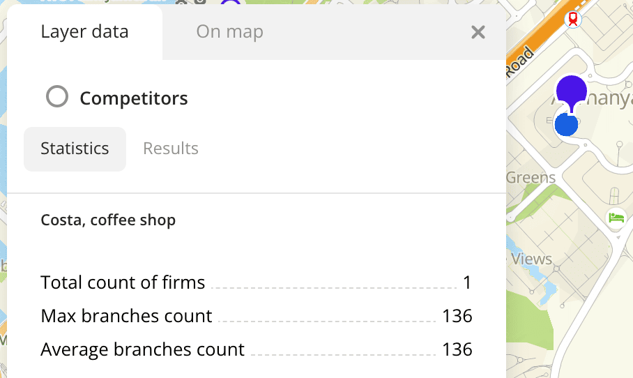
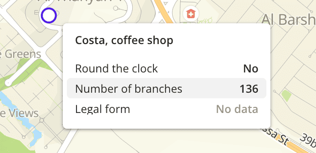
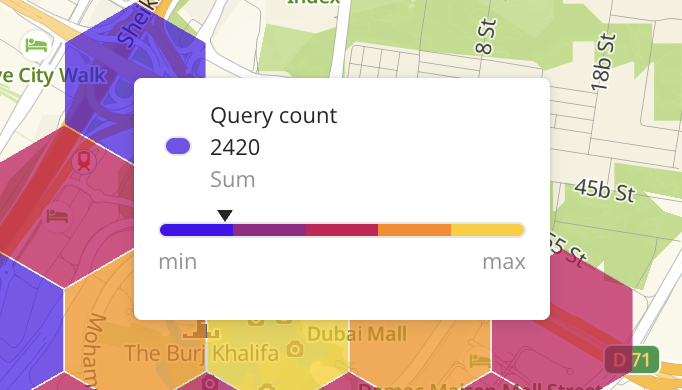
To get information about an item on the map:
-
Click the item on the map. Full information about the item is displayed in the new pane.
-
Hover the cursor over the item. A tooltip with a short help about the item appears.
For layers with the Point, Buildings, Line, and Polygon visualization methods, you can specify a list of data attributes when configuring visualization parameters. The attributes are displayed in the tooltip. You can also configure a tooltip for a dataset uploaded as a file.
For layers with the Grid, Hexbin, Buildings, Contour, Cluster, and H3 visualization methods, you can select the color aggregation type when configuring visualization parameters. The type is also displayed in the tooltip.
What's next?
- Quick start.
- Get to know how to work with Data.
- Get to know more about Layers, Dashboards, Scenes, and Widgets.
- Get to know prepared Analytics presets.