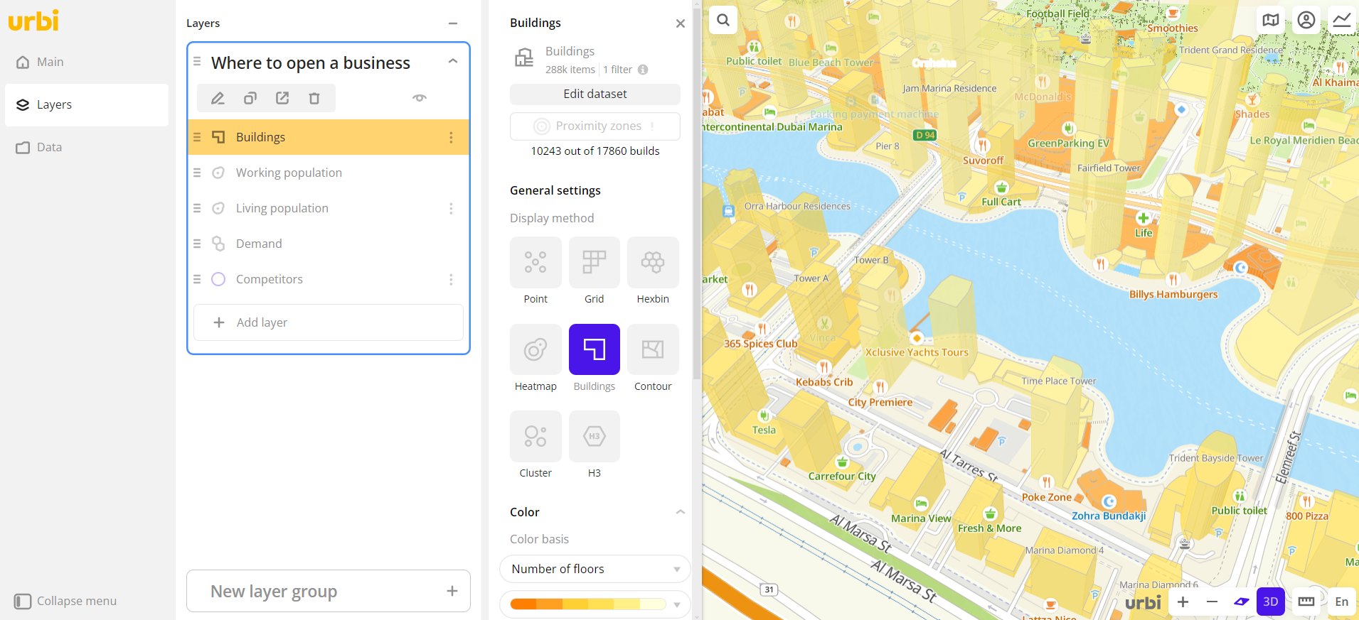
Buildings
The Buildings visualization method is useful when you need to understand the distribution of data in relation to buildings. Physical and legal boundaries of buildings are taken into account.
Overview
To choose a visualization method:
- Go to the Dashboards tab.
- Open the required dashboard.
- Open a scene using the arrows
 and
and  . If there is only one scene in the dashboard, it opens automatically when you open the dashboard.
 - To open the layer, click
 icon and select the required layer.
 - In General settings, select the Buildings visualization method.
- Set the remaining visualization parameters if necessary.
The data is visualized on the map.
Parameters
For the Buildings visualization method, the following parameters are available:
-
Tooltip setup: enable to customize the list of attributes that are displayed when hovering the cursor over the item on the map. Select the required attributes and change their order if necessary. The available values depend on the data in the sample.
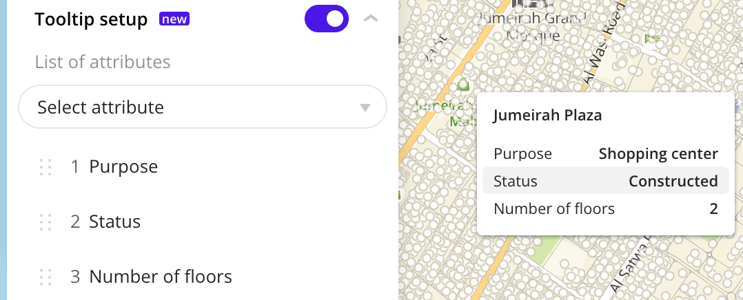
If the option is disabled, the tooltip shows all data attributes from the dataset.
-
Color: selecting the color of the data display. You can color elements in two ways:
-
Color basis: attribute based on which the elements on the map and in the legend are colored according to the color scale. The available values depend on the data in the sample.
To reset the parameter, click
 icon next to the parameter name.
-
Color scale: set of prepared color samples.
-
Invert: select to invert the selected color scale.
-
Steps: number of steps in the color scale from
1to10. -
Legend: configuring of data ranges in the legend. Ranges are calculated automatically depending on a type of scale (for
Logarithmic,Linear, andExponentialtypes). You can also customize ranges manually by entering the required range limits or changing the order and number of ranges (Adjustabletype). The specified upper (right) limit is not included in the range. The maximum number of ranges is 10.
To change the order of ranges, hold down icon next to the required range and drag it. To add a range, click
  icon. To delete a range, click
  icon.
icon. -
Color aggregation type: function used to aggregate the attribute values located in one visualization element:
Sum- the sum of the values.Mean- the mean value.Median- the median value that is equal to or greater than 50% of the values in the group.Min- the minimum value.Max- the maximum value.
-
Type of scale: distribution type used to calculate data ranges in the legend. Available only for numeric attributes:
Logarithmic- logarithmic distribution. Suitable for displaying data that changes over a wide range or differs by several orders of magnitude.Linear- uniform distribution. Suitable for displaying values of the same order.Exponential- exponential distribution. Suitable if you need to highlight small values and ignore large ones, and also for displaying data that changes quickly.Adjustable- manual configuring of ranges. In all ranges except the last one, the specified upper (right) limit is not included in the range.
-
Opacity: setting an opacity of the elements on the map.
-
-
If the Color basis is not selected, you can select a color from the palette or specify it in HEX format. The elements on the map are colored the same, and the color legend is not displayed.
-
Color aggregation type: function used to aggregate the attribute values located in one visualization element:
Sum- the sum of the values.Mean- the mean value.Median- the median value that is equal to or greater than 50% of the values in the group.Min- the minimum value.Max- the maximum value.
-
Opacity: setting an opacity of the elements on the map.
-
-
What's next?
- Quick start.
- Get to know how to work with Data.
- Get to know more about Layers, Dashboards, Scenes, and Widgets.
- Get to know more about other Data visualization methods.
- Get to know prepared Analytics presets.