Data aggregation
Aggregation is a way of transforming data into one resulting value: sum of values, average value, and others. To enrich the data for a particular area on the map, you can aggregate data from another layer. Example scenario: calculate the average rating of competitors or the amount of living population within a 5 minute proximity zone for a new organization branch.
Important
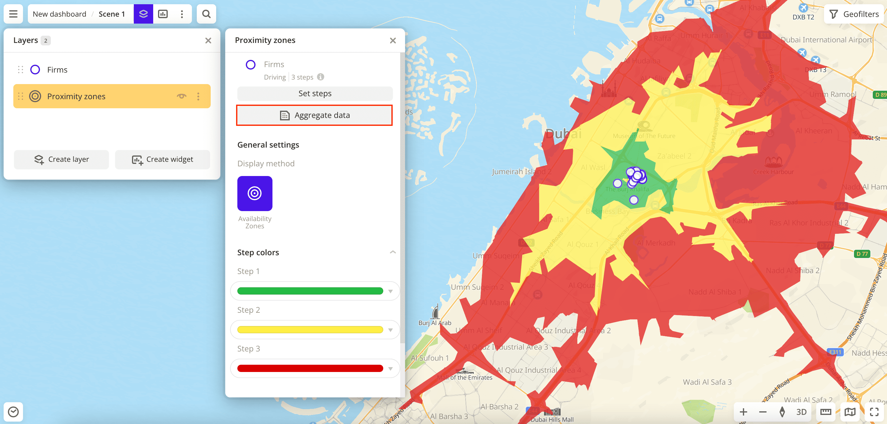
Aggregation is available only for layers with areal objects: with Polygon (e.g., for layers created from the system dataset Territorial division) and Proximity zones visualization methods.
Creating aggregation

-
Create a layer with data that you want to aggregate.
For example, if you want to aggregate data about residents, create a layer from the Population category for the required territory.
-
Create a layer with areal objects: Polygon or Proximity zones visualization method.
Both layers (with data and with areal objects) must be within one dashboard scene.
-
Go to the Dashboards tab.
-
Open the required dashboard.
-
Open a scene using the arrows
and
. If there is only one scene in the dashboard, it opens automatically when you open the dashboard.
-
To open the layer, click
icon and select the required layer with areal objects.
-
Click Aggregate data.
-
Set aggregation parameters:

- New layer name: enter the name of the resulting layer.
- Data layer: select a layer with the data you want to aggregate.
- Attributes: specify the data type for aggregation. Dataset depends on the selected layer.
- Aggregation method: select a method of transforming data.
To add aggregation of other data or another method, click Add attribute.
Note
You can add not more than 20 attributes for one aggregation layer.
-
Click Create.
A new layer with the Polygon visualization method is created and automatically added to the selected dashboard scene. If necessary, you can specify visualization parameters for the layer.
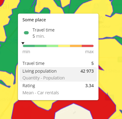
To see the aggregated data in a tooltip, hover over any polygon or proximity zone:

What's next?
- Quick start.
- Get to know how to work with Data.
- Get to know how to build Proximity zones.
- Get to know more about Layers, Dashboards, Scenes, and Widgets.
- Get to know more about other Data visualization methods.
- Get to know prepared Analytics presets.